Woodland
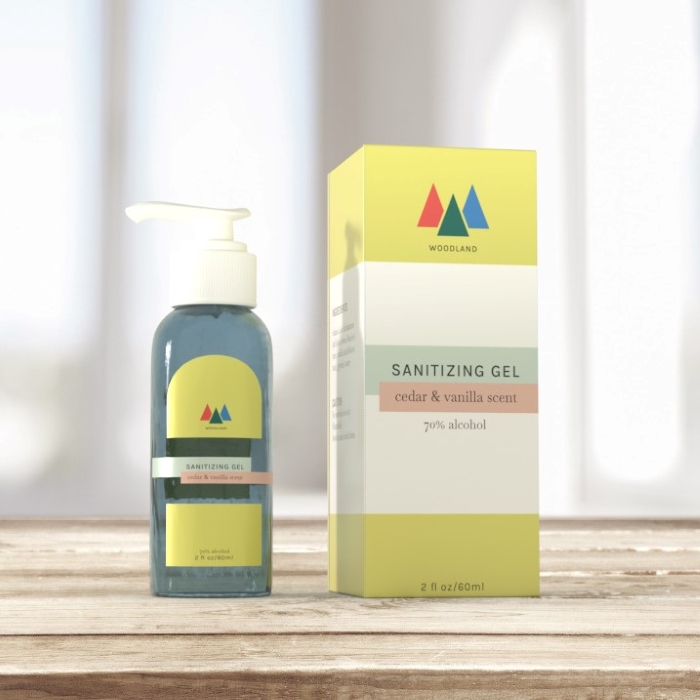
Purpose: This is my take on Woodland, a company that focusses on cleansing and sanitizing products. My goal was to create an aesthetic design that differentiates itself from its competitors.
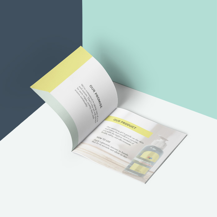
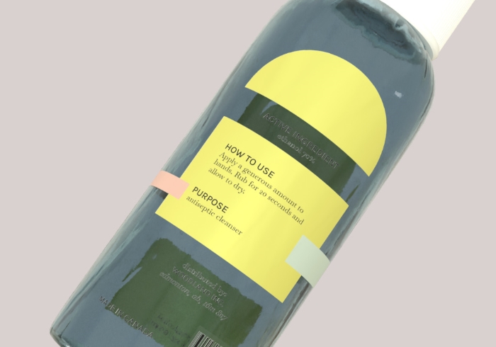
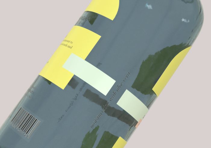
Technique: The majority of the package uses pastel colors to compliment the deep colored logo. The design was made to wrap around the entirety of the bottle while keeping the negative space. An information booklet was also created to compliment the product which can be viewed below.


Typography


Color Palette
